A visually striking new ad from a Republican Senate candidate provides a stark image of the U.S. debt problem — and almost gets the numbers right.
The 30-second spot hit the airwaves in Wisconsin April 7. It shows GOP Senate candidate Eric Hovde climbing up the foothills of an Everest-like graph depicting the soaring federal debt.
Hovde’s scary-looking chart is accurate. But as he speaks, he exaggerates both the degree of current borrowing, and how U.S. debt stacks up against that of European countries.
Off by 6 Cents
“You know our government borrows 38 cents on every dollar it spends?” he asks. Actually, it hasn’t been borrowing at that level for some time.
The federal government borrowed a little over 36 cents of every dollar spent in the fiscal year that ended Sept. 30 last year — 2 cents less than Hovde claims.
But that was last year, and Hovde spoke in the present tense. Looking at this year’s projected spending, he’s even further off.
The government will borrow just over 32 cents for every dollar spent in fiscal 2012, according to the most recent projections from the nonpartisan Congressional Budget Office. That makes Hovde’s claim nearly 6 cents too high.
We have little doubt that most viewers would find borrowing 32 cents of every dollar spent to be alarming, and unacceptably high. So Hovde’s ad is yet another case of a politician hyping the facts, when the truth would do just as well — a common tendency we’ve noted more than once.
Off by Several Countries, Too
Hovde also exaggerates the extent to which U.S. debt levels rival those of troubled European economies. “We have more debt to our economy than all but three European countries,” he states. That’s not true.
Hovde is far off the mark, according to the most recent figures from the Organisation for Economic Co-operation and Development, which tracks the economies of 40 industrialized nations. The OECD put U.S. debt at 61 percent of gross domestic product in 2010, lower than eight European Union member nations. In order, those nations were Greece (148 percent), Italy (109 percent), Belgium (97 percent), Portugal (88 percent), the United Kingdom (86 percent), Hungary (74 percent), France (67 percent) and Austria (66 percent). And just for the record, all were much less than the debt of Japan (184 percent), which has the heaviest debt burden of all industrialized economies.
Hovde’s ad is also wrong according to the very latest figures from Eurostat, the statistical office of the European Union. As of Sept. 30, 2011, the highest debt-to-GDP figures in the European Union were those of Greece (159 percent), Italy (120 percent), Portugal (110 percent), Ireland (105 percent), Belgium (99 percent), France (85 percent), the United Kingdom (85 percent), Hungary (83 percent), Austria (72 percent) and Malta (70 percent).
All 10 of those European nations had higher public debt than the United States. The comparable figure for the U.S. — debt owed to the public, not counting money the government owes to itself — was just under 68 percent as of the end of fiscal year 2011, on Sept. 30.
There are 27 EU member states. So Hovde could have made his point — and stuck to the facts — by saying that the U.S. has a higher debt-to-economy ratio than two out of three European nations.
It is possible to argue that the U.S. debt is higher than all but four European nations (not three) by looking at figures from the International Monetary Fund’s World Economic Outlook Database. But those figures count the borrowing of all state and local governments, not just what the federal government owes to the public.
According to the IMF, total U.S. federal, state and local debt amounted to 94 percent of GDP. Among European nations, only Greece (143 percent), Italy (119 percent), Belgium (97 percent) and Ireland (95 percent) were higher, according to the IMF’s most recent figures.
But those IMF figures don’t refer to the measure Hovde’s ad uses. Hovde’s eye-catching chart is based only on the federal government’s debt (not state or local). And it counts both money borrowed from the public (the figure economists find most relevant to the economy) as well as money the federal government owes to itself, mainly through the Social Security trust funds (which are not counted by the IMF, OECD or Eurostat.)
Nice Chart, Though
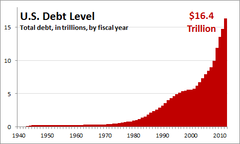
By Hovde’s measure, total federal debt indeed now stands at $15.6 trillion. That’s the figure shown in his ad for 2012. In fact, we would have accepted an even higher figure. The Office of Management and Budget projects the total or “gross” federal debt will reach nearly $16.4 trillion by the end of fiscal year 2012.
And there’s nothing misleading about the way Hovde’s chart looks, either. Just to check for any funny business with the graphics, we constructed our own chart based on official end-of-fiscal-year debt figures from OMB’s historical tables. And as readers can see for themselves, it takes the same shape as the ever-steeper slope that Hovde is attempting to scale in his TV spot.
In the ad, Hovde argues that “this is not just an economic crisis; it’s a moral crisis. The path the politicians gave us is destroying our children’s future.” Those of course are opinions, and it’s true that money borrowed today can be a burden on the children of those doing the borrowing and spending. We’ll have to leave it to our readers to judge for themselves what’s “moral” or not, whether the rise in debt has become a true “crisis,” and whether it is “destroying” anyone’s future.
Nevertheless, we applaud Hovde and his media team for sticking to an accurate and informative visual representation of the skyrocketing debt — even if they couldn’t resist exaggerating the facts about current borrowing or how many European nations have borrowed more.
–Brooks Jackson
